Home
Tutorial: Comparing with Electron Microscopy
Contributors: Kristian Lytje, Jeppe Breum Jacobsen, Jan Skov Pedersen

Black: SAXS data. Red: fit from EM map using AUSAXS. The grey shape is a contour of the calculated EM structure which agrees best with the SAXS data. The atomic structure is shown in orange. From: https://doi.org/10.1107/S2059798324005497
Before you start
- Make sure you have the following free software installed:
(1) The AUSAXS software.
(2) Python (including numpy, scipy, and matplotlib) to visualize the results.
(3) A qualitative understanding of SAXS data is advantageous, but not required. See for example Tutorial: Primary Data analysis.
Learning outcomes
In this tutorial you will learn how to use the EM validation program of the AUSAXS software to compare SAXS data with electron microscopy data.- Be familiar with the AUSAXS software.
- Be able to validate an electron microscopy map against SAXS data.
Introductory remarks
Electron microscopy has in recent years become a popular and powerful technique for studying the structure of biological macromolecules.
A primary issue with the technique is that it is not performed under native conditions, and the resulting maps may therefore not be representative of the solution structure.
Many validation techniques have therefore been developed to assess the quality of the maps, typically by comparing bond angles, bond lengths, and other geometric properties
with known structures. AUSAXS is a new software package that can be validate the maps by comparing them against small-angle X-ray scattering (SAXS) data.
In this tutorial, we will explain how to use AUSAXS to compare small-angle X-ray scattering data with EM data.
Note that these are very different techniques, with the former probing the electron density of the sample, and the latter probing the charge density.
We are therefore not expecting perfect quantitative agreement, but will rather focus on comparing the data qualitatively.
For more information on how the comparison is practically performed, please refer to the AUSAXS paper.
Part I: Performing a basic validation
Now we are ready to perform our first validation. Download the files:- The SASDJG5 SAXS measurement
- The EMD-24889 EM map file Remember to unpack the zipped map before continuing.
- Graphical interface:
If you have moved the program from the downloaded folder, make sure to also move the plotting script to the same destination.
Open the AUSAXS programem_fitter_guiand load both the EM map and SAXS data.
For this run only, set the "sample frequency" to 2 (and make sure to hit "enter"!). Then click the "start" button.
You may also have to run theplotprogram (or script) to generate the plots. - Command-line interface:
Move all files to the same directory, and launch a terminal from there.
Then run the command:em_fitter emd_24889.map SASDJG5.dat em --frequency 2 saxs --qmax 1 - Windows:
./plot.exe - Mac or Linux:
python scripts/plot.py - A "report.txt" file
- An "ausaxs.fit" file
- Various plots (if you don't see any plots, run the
plotprogram or script.) - Various "*.png.plot" files
- A "models" folder
- chi2_evaluated_points_limited.png: This plot shows the relevant $\chi^2$ value for every threshold value sampled during the fit. This is very useful for checking the convergence - if the lowest $\chi^2$ value is found at either edge of the x-axis, you should rerun the fit using larger bounds. The plot is also useful for seeing if there could be more than one optimal solution. These should already be marked by a blue point. We will return to these later.
- chi2_evaluated_points_full.png: This plot is identical to the previous one, except it shows all $\chi^2$ values. The other version is usually more relevant since it can better show the variation near the minimum.
- chi2_near_minimum.png: This is yet another $\chi^2$ landscape, except with greater detail near the found minimum. Though the true minima is marked in blue, it is better and more honest to report the mean $\chi^2$ value as denoted by the red line. This plot is primarily useful for estimating the quality of the found minimum. Large $\chi^2$ fluctuations in this region indicates a poor minima, which is typically due to too few voxels. In our case the quality is okay. You can try improving it by rerunning the fit using a sampling frequency of 1, though this will take substantially longer.
- log.png and loglog.png: These two plots is simply a plot of the SASDJG5.scat and ausaxs.fit files with a logarithmic y-axis. The latter also uses a logarithmic x-axis, should you prefer this. The optimal $\chi^2$ value is also shown, though as we previously argued, we are not too interested in its specific value. Instead, we want to qualitatively compare the two profiles. Though this type of analysis is quite subjective, if the same features are present in roughly the same locations, we can be content. In our case, the agreement is good enough to validate the map.
- Exercise 1: Try validating the emd_24889 map using incompatible SAXS data. As an example, you could try with these lysozyme data. How can you see that the map and this new SAXS data are not in agreement?
- Exercise 2: Try fitting it again, but this time using the SASDJQ4 data. Note that you will have to rename the file extension to ".dat" for the AUSAXS software to accept it. How does the $\chi^2$ landscape look now? This example illustrates that it is sometimes not enough to only judge the fit quantitatively, as large uncertainties in the data can lead to artifically small $\chi^2_r$-values.
- Exercise 3: Try visualizing both the dummy structure and the corresponding optimized map together in e.g. PyMOL. Is the dummy structure a good approximation of the map? You can also try comparing with the PDB structure associated with the SAXS data (download link).
- Exercise 4: Try running the fit again using a sampling frequency of 3 with the $\alpha$-level bounds 6, 15. Repeat the fit a few times, and shift the $\alpha$-level interval by 0.1 each time. Remember to save the plots - they can be found in the "output" folder. Compare the plots and the $\chi^2$ values. What happens? Does it make sense why the mean $\chi^2$ value should be reported?
- Reporting issues and bugs via our GitHub page. This could be typos, dead links etc., but also insufficient information or unclear instructions.
- Suggesting new tutorials/additions/improvements in the SAStutorials forum.
- Posting or answering questions in the SAStutorials forum.
- When the program is done, run the following plotting command:
Part II: Analyzing the output
You should now have the following files in the directory containing the program:We will go through each of these in order.
report.txt
This file is just a copy of the terminal output. If you ran the fit using the terminal, the first line will also contain the command used to perform this fit.
The first section is just the title, "FIT REPORT".
The second section contains various statistical properties of the fit. Our primary interest here is the reduced $\chi^2$ value, listed as chi2/dof, defined as the $\chi^2$ per degree of freedom.
This value is equivalent to what is typically reported by other fitting programs such as the ATSAS program.
For a perfect fit, this value should be close to unity.
However, since we already know in advance we will not be getting a perfect fit due to us comparing two different experimental techniques, we will not put too much weight on its exact value.
The third section contains the optimized parameter values. We are not too interested in these either.
The fourth section is relevant if you want to visualize the optimal map structure using e.g. PyMOL.
It contains the PyMOL $\alpha$-level, defined as the root-mean-square of the map, equivalent to the optimal cutoff threshold value. Simply input this value in the "level" field when loading the map, and select either "mesh" or "surface" to see the optimized map.
This section also contains the mass of the optimized structure. However, this value is very approximative, and only serves as a quick guideline.
ausaxs.fit
This file contains both the used part of the experimental SAXS data and the fitted intensity evaluated at those q-points. Note that this file is compatible with the ATSAS plotting utility for easy visualization.
Understanding the plots
-
You will find a number of ".png" files in the directory.
Advanced: You can also modify these plotting instructions to customize the plots using a simple text editor. The format is somewhat self-explanatory, though an extensive guide is available at https://github.com/AUSAXS/AUSAXS/wiki/Plotting-scripts should you need it.
The "models" folder
When we earlier looked at the $\chi^2$ landscape, we saw there were multiple almost equivalent minima.
The fitter has chosen the absolutely smallest one and generated the dummy structure "model.pdb" for it.
Structures for the other minima have instead been saved in the "models" folder.
The "info.txt" contains a small description of each.
Note that sometimes the dummy structure may contain more than a hundred thousand dummy atoms.
Since the PDB format officially only supports up to 99 999 entries, in such cases the structure will be split into multiple files.
Continuing the analysis
Now that we understand the output, we are ready to continue our analysis.
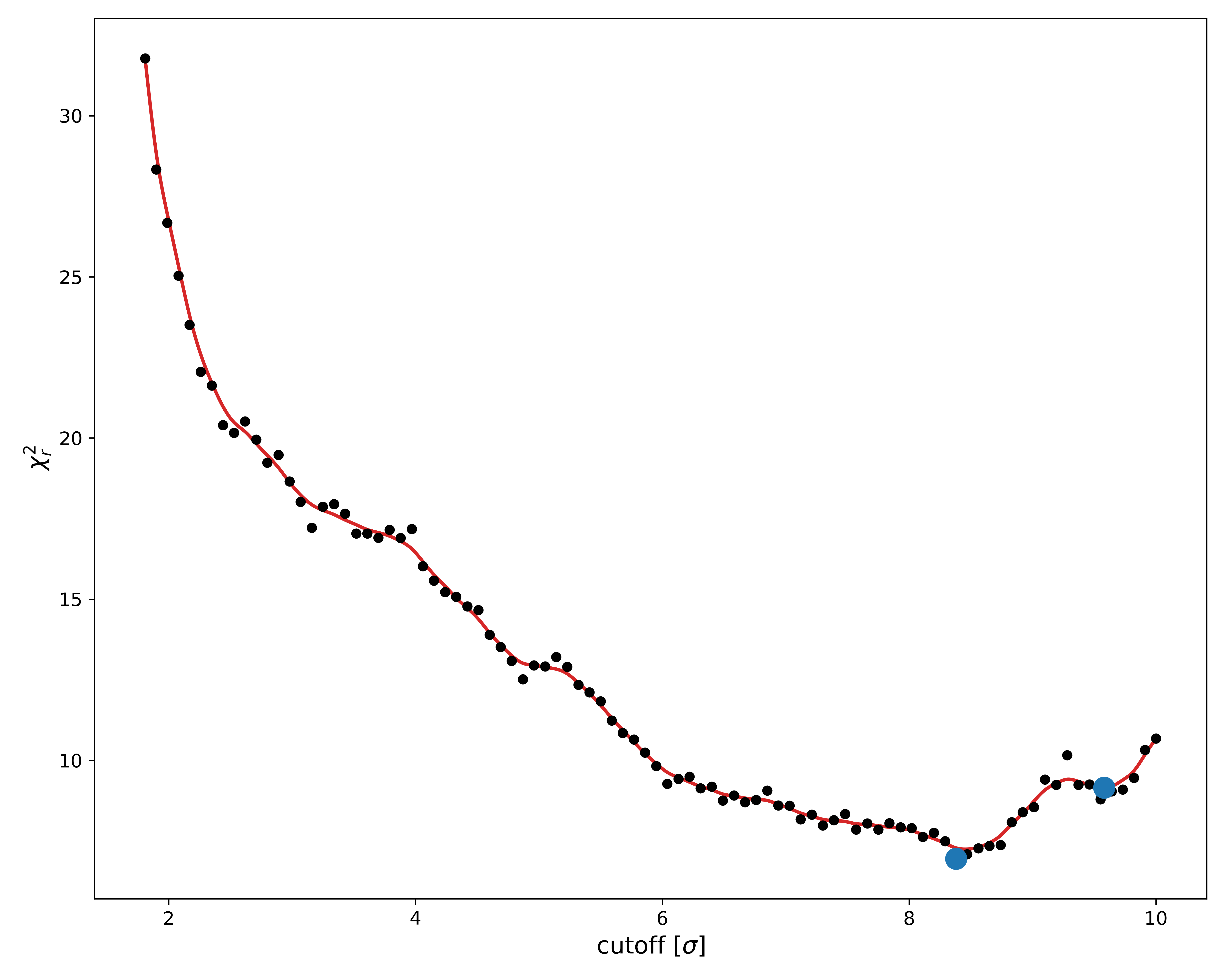
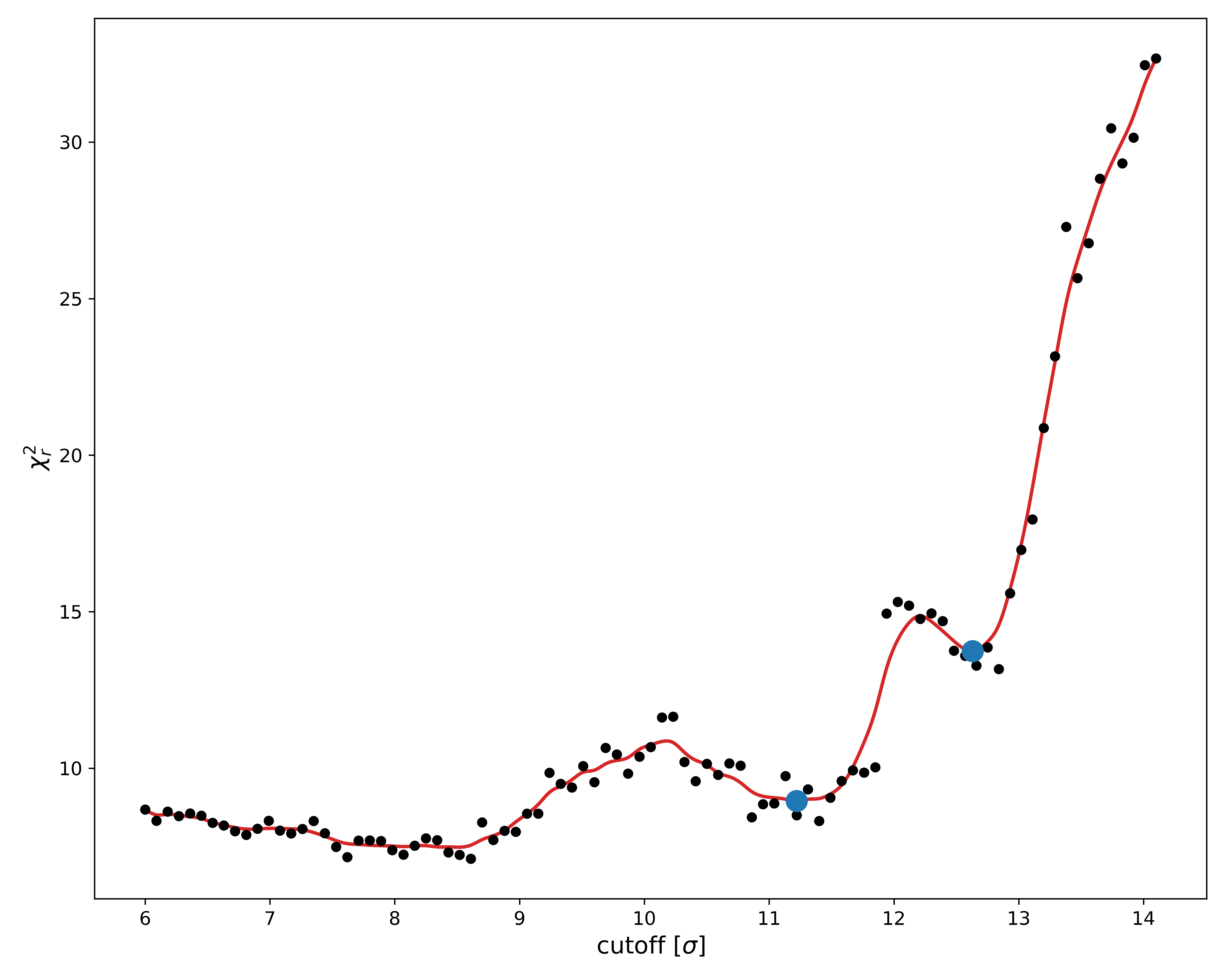
As per our previous discussion, we are looking for minima in this $\chi^2$ landscape plot. Based on this, it seems like a lower minima could potentially be hiding just out of sight, at $\sigma$ > 10.
To check this, we should rerun the fit and make sure to cover this area.
Change the maximum $\alpha$-level to 15.
command: em_fitter emd_24889.map SASDJG5.dat em --frequency 2 --levelmax 15 saxs --qmax 1
Since we are impatient and know there are no minima at $\sigma$ < 6 anyway, let us skip these too by also modifying the minimum level.
command: em_fitter emd_24889.map SASDJG5.dat em --frequency 2 --levelmax 15 --levelmin 6 saxs --qmax 1.
Remember to re-run the plot command to refresh the plots.
Looking at the new $\chi^2$ landscape, it appears as though our original bounds were fine.
Since there is a rather large amount of noise in the $\chi^2_r$ values, let us rerun the fit without discarding any data.
We can do this by changing the sampling frequency parameter, which controls how often the EM map is sampled.
A value of 2, as we used previously, means that every second voxel in each direction is sampled, thus effectively reducing the number of voxels by a factor of 8.
This is fine when we are looking at regions with a lot of data (i.e. low $\alpha$-levels, meaning high mass), but when we are looking at high $\alpha$-levels, a higher sampling frequency can lead to more noise in the $\chi^2$ landscape.
Set therefore now the sampling frequency to 1, and rerun the fit while making sure to use the new bounds.
Since we are only scanning relatively high $\alpha$-levels, this shouldn't take too long.
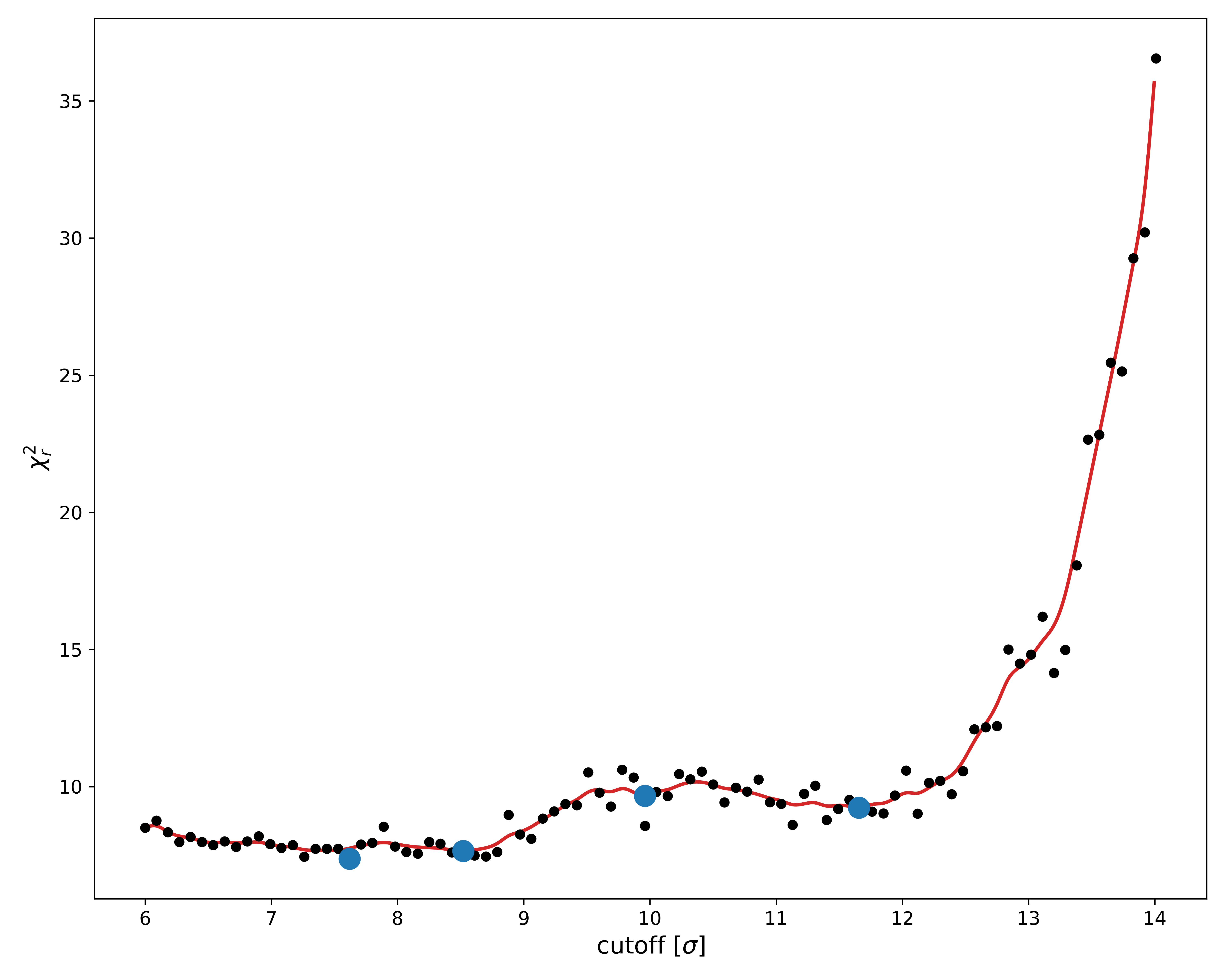
As we can see, this was only partially successful. The new $\chi^2$ landscape is still quite noisy, which is likely due to the hydration shell.
When looking at the fitted parameters in the "report.txt" file, we see that the hydration shell scattering power parameter "cw" is significantly higher in the new fit,
meaning the hydration is more important now than before. This would indicate the optimization is more difficult, and hence the larger variation in the fitted values.
Regardless, we see that the minimum $\chi^2_r$-value around $\sigma$ = 8.2 is still the best, which roughly agrees with what we found previously.
We can also confirm this value by looking at the "info.txt" file inside the "models" folder.
And that's it!
You have now learned how to perform and understand a simple validation of an EM map. You can either repeat the above analysis using your own map, or you can try your hand at the excercises and challenges posed below.
Exercises
Challenges
As a practical example of how this program can be used, download the following three files. For the last two links, you will need to click the "Download raw file" button in the top right corner, underneath the "History" icon.
Recently, there has been some controversy regarding the structure of the A2M protein, with two different groups finding different conformations of the protein using cryo-EM (emd_12747.map) and negative-stain EM (A2M_2020_Q4.ccp4) [1, 2, 3, 4]. The SAXS data measured by the second group (A2M_native.dat) has also been provided. Use the SAXS data to validate both maps, and compare the results. Which conformation does the SAXS data support?